
Labra’s Dashboards get a new look today!
Introducing Unified Insights Dashboards – your one-stop shop for all Cloud GTM-related data.
This fundamentally changes the way you view your Cloud GTM data – letting you gather the latest insights on your revenue and deal data in one single view.
From high-level insights at a glance to easy drill-down and data export options, you can get any information you want at the tip of your finger. Having easy access to essential information helps your teams make better-informed decisions, especially as you scale and multiple teams, such as revenue, alliances, and sales, are using Labra.
The Unified Insights Dashboard is now the default home page on the Labra App and is also available on our Salesforce Experience. It can also be easily accessed through the sidebar.
Note: For any Labra modules you use, Dashboards will be auto-populated with your current and historic sales data. In case of difficulties, do reach out to your Labra CSM for assistance.
Unified Insights Dashboards consists of two parts: Dashboards and Reporting.
Dashboards
With the new Dashboards, you get an overview of your Cloud GTM operations in an organized, easy-to-digest format. These dashboards are categorized according to your role within your organization.
The Overview Page
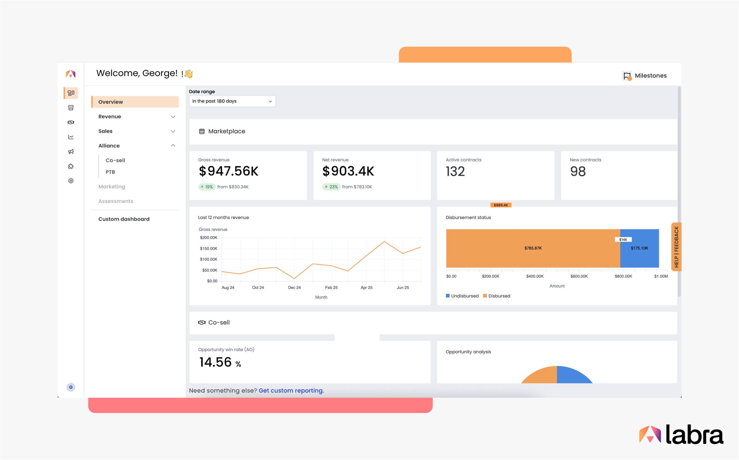
The Overview Page breaks down key revenue insights across all your hyperscalers and Cloud GTM channels in one place — marketplace, co-sell, and partners.
It also gives you insights specific to each Labra product. For example, if you want to access insights under ‘Marketplace’, you can simply click on the ‘View more’ button to surface data from the relevant dashboards page.
Other Labra products include Marketplace, Co-sell, Marketing, Propensity Scoring, and Assessments.
Revenue Dashboard
Built specifically for your Revenue teams, you can access all the latest insights into your revenue pipeline, top buyers, tax details, product mix, and more.
It also comes with a disbursements tab, which shows the breakdown of the amount disbursed, to be disbursed, and the average days to disbursement.
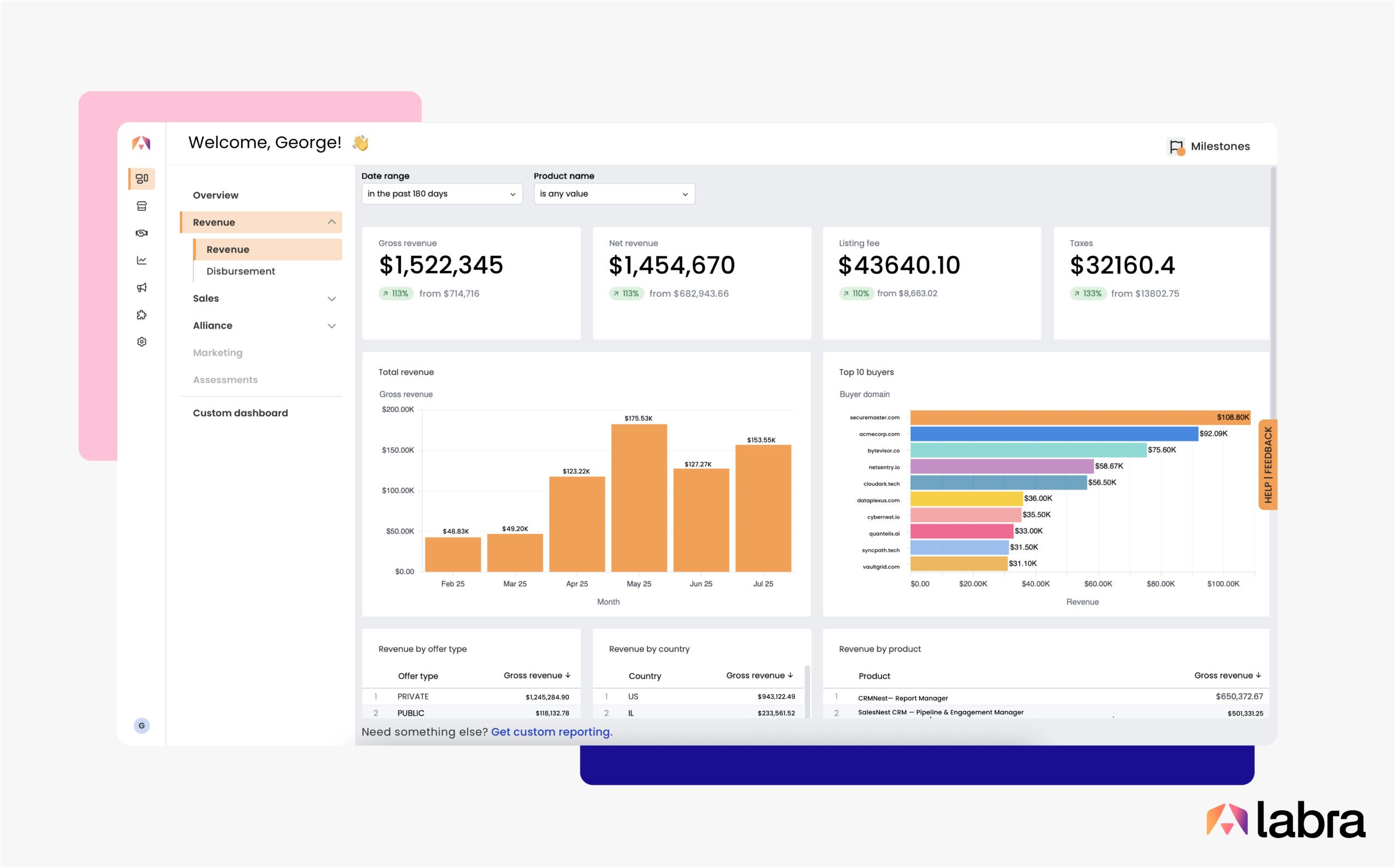
The Revenue Dashboard is great for answering questions like:
- What’s the country-wise breakdown of Q3’s revenue?
- How much has been paid in Marketplace fees and taxes?
- Where can I see a list of invoices with their payment terms?
Sales Dashboard
Sales Dashboard is broken down into three key pages: contracts, offers, and resellers.
- Contracts: Shows total contract value, churned contracts, active, and new contracts.
- Offers: Displays total offers accepted with a month-wise breakdown, along with the average deal size, average close time, a list of contracts expiring soon, and more.
- Resellers: Displays the number of resellers, the number of resale offers sent, the average deal size, and more.
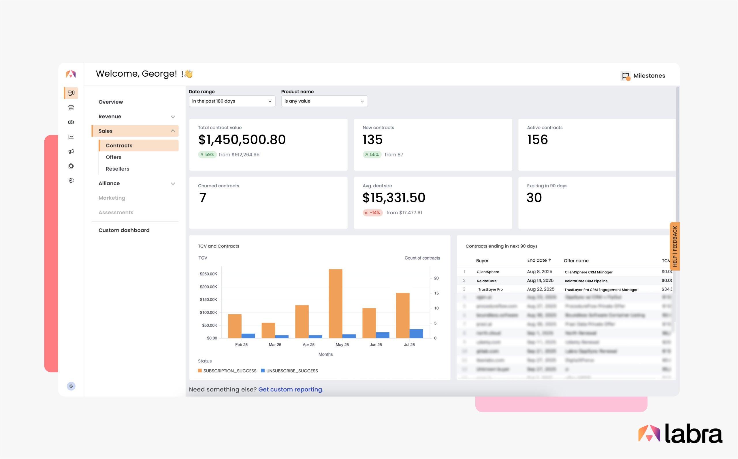
The Sales Dashboard is great for answering questions like:
- How many contracts did I win vs how many churned in the past quarter?
- Which contracts are expiring in the next 90 days?
- What’s the status of the offers my team sent out last week?
- What’s the average time to close?
Alliance Dashboard
Here, you’ll find consolidated information about all your co-sell initiatives across three major cloud hyperscalers (AWS, Google Cloud, and Microsoft Azure), with default breakdowns as well as propensity to buy data.
- Co-sell: Shows your entire opportunity lifecycle in one view. Get details on your typical sales cycle, breakdowns by industry and region, identify your top campaigns, and more!
- PTB: Shows you a quick picture of your overall pipeline health, deal size, conversion rate, and how high PTB leads have converted.
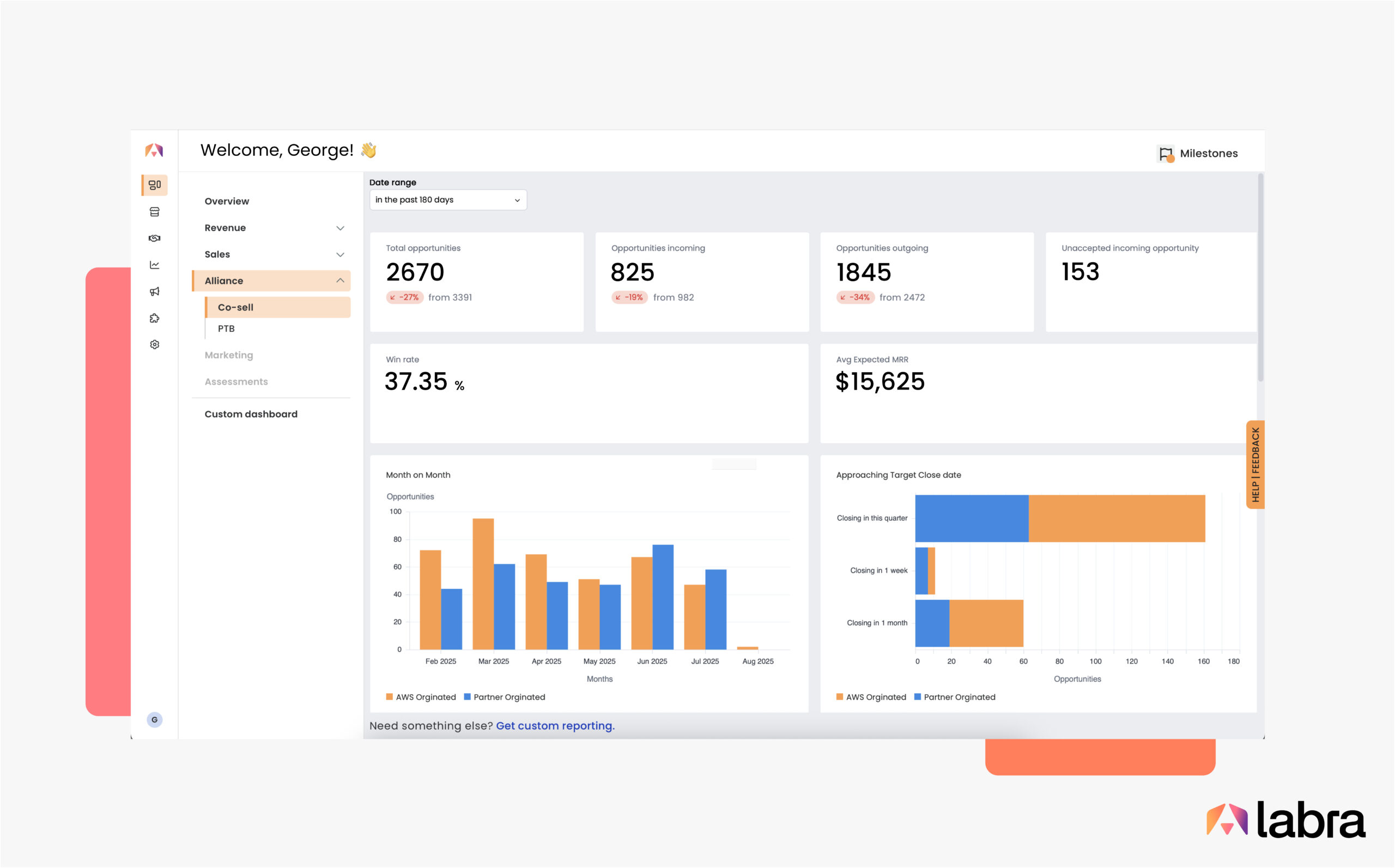
The Alliances Dashboard is great for answering questions like:
- What’s the breakdown of won-lost deals by region?
- How many opportunities are still in the prospect phase?
- How much net new business am I getting from AWS?
- How many high propensity accounts are in my pipeline?
Customize to find exactly what you’re looking for
Make the most of Unified Insights Dashboards by understanding these key features:
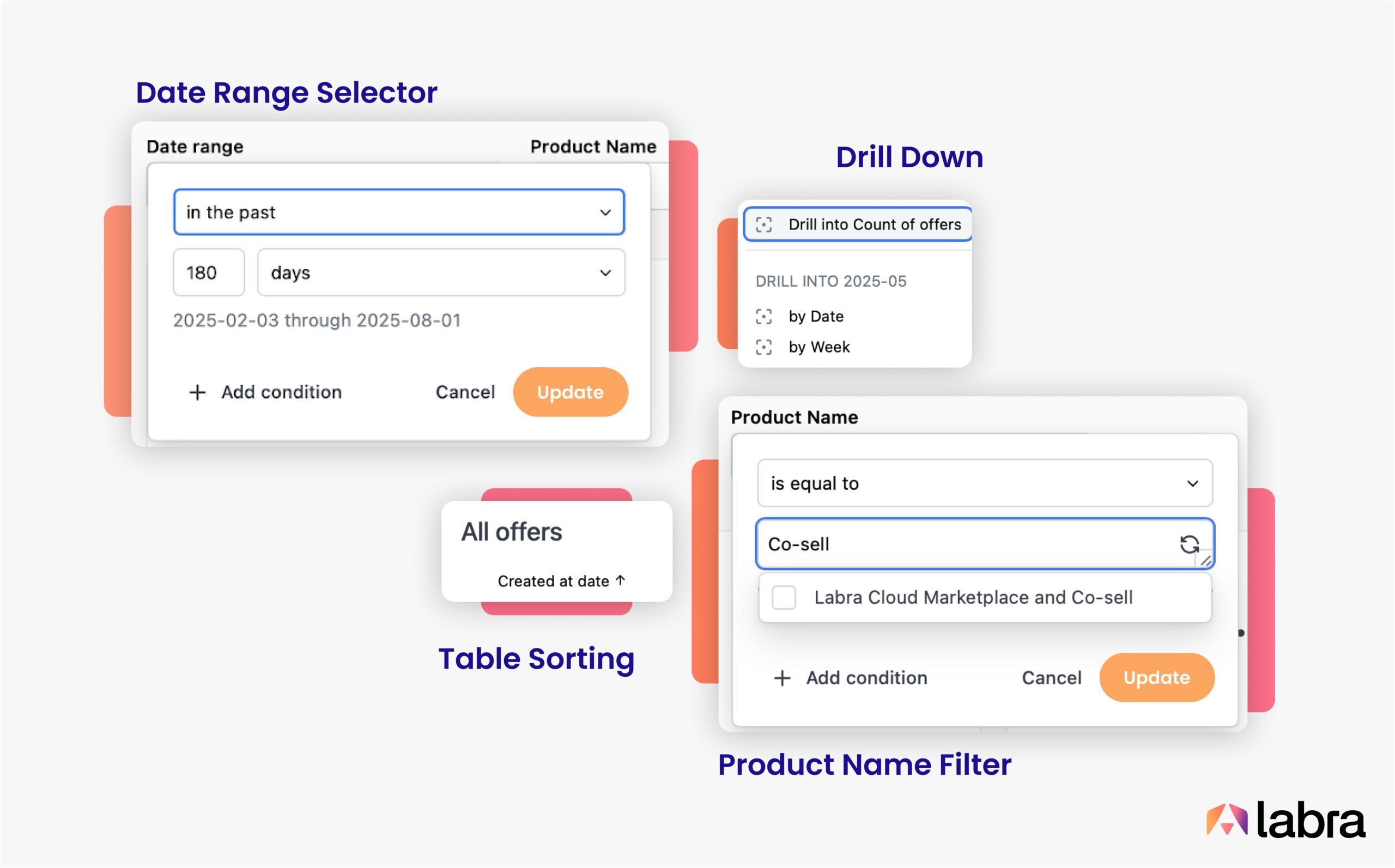
- Date Range Selectors: Above each dashboard is a date range selector to set the start and end dates.
- Filters: Certain pages, such as Contracts, Co-sell, and Offers, have additional filters, such as ‘by cloud provider’, ‘product name’, etc.
- Sort: You can sort the table in either ascending or descending order.
- Table View: Each page features a table view at the bottom, providing the most up-to-date information for your selected date range.
- Drill-downs: Clicking on a chart opens a table with the related data, making it easy to drill down for more details.
Need a specific report or dashboard? Custom Dashboards are available for power users at an additional cost.
Reporting
Beyond visual dashboards, Labra’s reporting tools give you precise control over how you view, extract, and share your Cloud GTM data with your team and beyond. Whether you need a quick snapshot for a team sync or a deep dive for your quarterly board deck, Labra’s flexible reporting options make it easy.
Labra always keeps your data up to date and in sync with the Cloud Marketplace and Co-sell portals you’ve connected. Every chart and table, and even entire dashboards, can be exported, scheduled, or integrated into your own analytics stack—so your most critical insights are always ready when and where you need them.
Downloading reports
Every dashboard has a timestamp below to indicate the latest status of the last report generation. Simply refresh the page to fetch the latest data.
To download the entire dashboard as a report:
- Click on the Download button 📥 at the bottom of your screen
- Give a file name and select the file format
- Select additional options if needed and click “Create File”
To download a single chart/table as a report:
- Hover over the right top corner of the chart/table
- Click on the three buttons and select Download 📥
- Give a file name and select the file format
- Select additional options if needed and click “Create File”
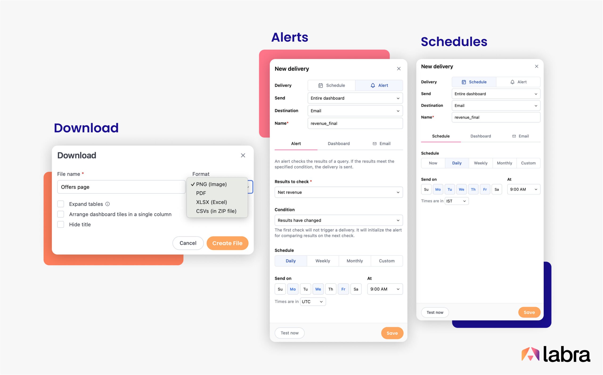
Reporting data is available in widely used formats and can be easily ingested into third-party analytics software. Reports are available for download in the following formats: PNG, PDF, XLSX, and CSV.
Scheduled reports
Reports go beyond basic downloads. You can set up recurring reports that are delivered directly to your team’s inbox or connected to third-party tooling through webhooks or SFTP.
Choose from daily, weekly, monthly, or custom schedules and have fully customizable report delivery with selected charts and data points from the dashboard, along with filters.
Setting up a Schedule for the entire dashboard
- Visit the dashboard of your choice, click on the Schedule icon (➤).
- Set a Schedule and choose a delivery method.
- Enter the schedule details and the emails in the email tab.
- Click on Save once done.
Setting up a Schedule for selected Chart/table tile:
- Hover over the top right until the three dots icon (⋮), select Schedule delivery.
- Set a Schedule and choose a delivery method.
- Enter the schedule details and add the emails in the email tab.
- Click on Save once done.
Setting up Alerts
Custom Alerts can be set up at a chart or metric level, helping you stay ahead of every shift in your GTM motion. You can configure notifications for changes in your Cloud GTM data—like a spike in disbursements, a high-propensity deal entering the pipeline, or a stagnant win rate.
Alerting can be set up by:
- Hover over the top right until the three dots icon (⋮), select Alert.
- Select the metric to share and choose a delivery method.
- Enter the Alert details and add the emails in the email tab.
- Click on Save once done.
Seven Things You Can Try Out Today
- Understand the strategic alignment of your accounts list through Propensity Scores.
- Identify how long (no. of days) your disbursements typically take.
- Know how many PTB-influenced co-sell deals you’ve closed compared to the previous period.
- Set up an email alert when there is a contract nearing expiry.
- Add a schedule to deliver emails with Total Contract Value (TCV) broken down across hyperscalers for your executives.
- Classify Opportunities by country and industry for a specified period.
- Download the co-sell dashboard for the last 30 days in PNG format to include in your monthly meeting presentation.
Ready for end-to-end Cloud GTM visibility?
Get started today with Labra’s Unified Insights Dashboards – your intuitive, powerful dashboards and reporting.